Showing posts with label data. Show all posts

Tuesday, 16 May 2023

No 262: Round Up of UK Economic Data

 LOTS of important UK macro data in the last week or so.

(1) The Base Rate of Interest was put up from 4.25% to 4.5%.

https://www.bbc.co.uk/news/business-65554797

(2) UK GDP Growth in Q1 2023 was only 0.1%.

https://www.bbc.co.uk/news/business-65562888

(3) ***TODAY*** UK unemployment (Q1 2023) has gone up from 3.7% to 3.9%.

https://www.theguardian.com/business/2023/may/16/uk-payroll-fall-unemployment-rate-rises

Referring to such "fresh" data is sure to impress the examiner! Even better if you read the articles above and absorb some more detail.....

Wednesday, 15 February 2023

No 257: Many Important UK Economy Figures This Week

 A BUMPER week for UK economic data. Here is a summary, but make sure you also read the full article given for each one:

UK GDP Growth was -0.5% in December. But over the quarter (Oct, Nov, Dec) it was 0%, so the UK avoided (just!) being in a recession. uk q4 gdp

Wages increased by a near-record 6.7% in Q4 2022, but this is still far below inflation. Unemployment remained extremely low - 3.7% for Q4 2022. uk wages / unemployment

Inflation for January was 10.1%, lower than the 10.5% of December, but still near record high. A particular worry is inflation in food and drink prices, which was 16.7%. uk jan inflation figures

Monday, 26 September 2022

No 225: Useful place to see live market data

 IF you want to see live changes in stock markets, exchange rates, bond rates etc (and who doesn't in the current economic situation), this has a good dashboard: https://www.marketwatch.com 

You can also click through to see charts. For instance here is the "Rates" dashboard which tells us about different interest rates governments are having to pay on their 10 year bonds:


If you click on a certain country's bond, you get more information including charts. Of course, what we all want to see at the moment is what's happening to UK government borrowing:


It's going up today, but it is even more striking to see what's been happening just in the last five trading days.

As you can see, the rate has increased by almost 1% since last Tuesday.

If you want to know why this is happening, read this previous post: 


Wednesday, 29 December 2010

No 171: 2010 in 9 Charts

I HAVEN'T before simply just copied an article straight into this blog. However, this recent article from "The Economist" is so informative, so useful, that I believe EVERYONE of you should try to read it, even though it is fairly advanced in places.


CHARTS OF 2010 - A YEAR IN NINE PICTURES


THE global property bust that pulled the world into recession in 2008 began to lift in 2010. House prices turned up in Britain and stabilised in America (chart 1) but slid further in Spain. The process of deleveraging kept rich-world inflation subdued (chart 2) while robust demand and loose monetary policy let it accelerate in India and China. By late 2010 output and employment had turned up in most rich countries but not enough to regain pre-crisis levels (chart 3).


Bowing to American pressure, China allowed the yuan to rise slightly (chart 4); higher inflation meant that in real terms it rose considerably more. Japan watched in alarm as a rising yen (chart 5) threatened its export-led recovery. Europe trembled as its sovereign-debt crisis undermined the euro.


Rich-world budgets remained deeply in deficit but at least those gaps generally shrank, most of all in countries, like Greece, undergoing austerity (chart 6).


Sadly, austerity did not provide the hoped-for relief: peripheral European government-bond yields continued to rise relative to Germany’s (chart 7).


Bonds’ best days may be over everywhere. In emerging markets and America bond prices increased through most of 2010 (chart 8) then fell as America’s economy sprang to life and investors flocked to equities. Commodities trounced both stocks and bonds (chart 9). Bulls attribute this to global growth, especially in the emerging world; bears cite a desire for inflation hedges. The tension between them will drive markets in 2011.


Tuesday, 28 December 2010

No 168: Fun with Google Ngram

THE tools on "Google Labs" are really cool. For example, Google Ngram allows a user to search the millions of books scanned into Google Books, to find how often different words or names have appeared in the past.

This can be very interesting for us economists.


For instance, this is what happens if you search using "inflation" and "unemployment":

Let's be clear what this graph shows: how often books contain the words "inflation" and "unemployment" between 1800 and 2008.

Firstly, it is clear that few writers talked about either inflation or unemployment until about 1870. This is probably because early Economics was almost universally concerned with microeconomics.

Inflation is the first of the 2 terms to start to be written about, but it is overtaken by unemployment in about 1905. Both of the terms, but especially unemployment, show a huge increase during the Great Depression of the 1920s and 1930s.

After World War 2, the incidence of inflation increases and that of unemployment falls, perhaps due to the Phillips' Curve and its emphasis of the correlation between the two. In the 1970s, inflation leaps up to the same level as unemployment, at the same time as the world economic crisis of the time which saw high levels of both.

The peak for both came during the recession of the early 1980s.

Since then, the frequency drops, possibly due to the relatively good economic climate until the Credit Crunch. It will be interesting to see how it has increased during our current economic crisis, in a few years when the data is available.

Here are some more Ngram graphs:


Not quite sure about Karl Marx's popularity around 1700, about 120 years before he was born! I guess this also shows how Adam Smith's has continued to be a very important figure, even when Marx was at his most influential.

Two more - war and peace first:

How about tea and coffee:


Come on, then, why don't you have a go? Just go to Google Ngram and then tell us about the graph you made.


(Technical note: choosing the option to search through "English One Million" gives a more even sample over the different years.)

Friday, 3 December 2010

No 162: Some Interesting Numbers from "Private Eye"

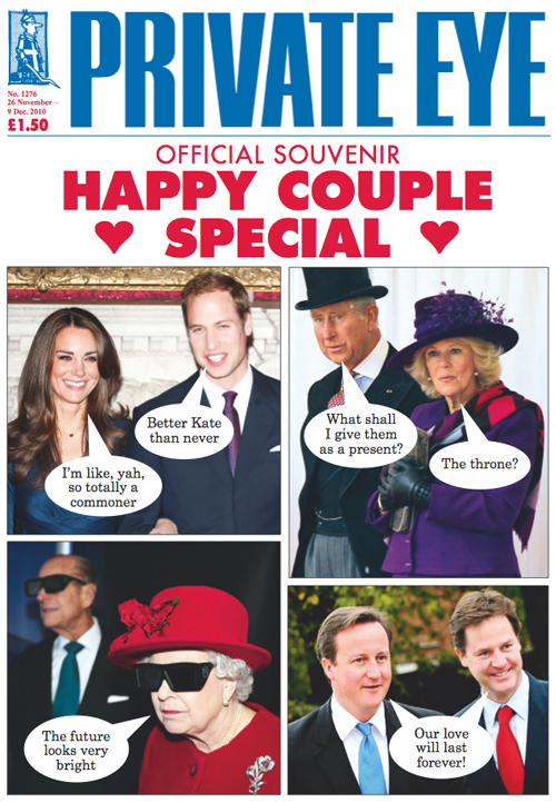
I DON'T have a particular newspaper that I read every day. However, I do make sure that every week I read "The Economist" (which hopefully you have heard of already), and "Private Eye".

You can probably tell from this week's cover the kind of magazine the Private Eye is....


In my opinion, satirical magazines like this, who watch very carefully what government and other powerful people do, are extremely important. This may be why usually one of the first acts of a dictator is to close down these kinds of publications. Plus, Private Eye is funny!

However, I am not the only person who believes in the importance of having a strong opposition to the government.

As reported in last weeks "Economist":

"In a video shown on state television, President Dmitry Medvedev said that Russia’s political system was showing signs of “stagnation”, and that the lack of serious opposition meant that Russia’s ruling party, United Russia, was in danger of “bronzing over”."

Now I don't want to say too much about Russian politics, since it not something I know a lot about. However, it does seem to me a bit strange that one of the leaders of a political party which has been well known for trying to silence opposition, is now complaining because now there is no opposition.......
In any case, back to "Private Eye". One feature I like in it is called "Number Crunching", and here are a few examples:


Monday, 23 August 2010

No 142: Statistical Analysis of Exam Performance

I WANTED to wait for a few days until you have all had time to digest your exam results before I gave you my comments.

Of course every student is interested in his or her own performance, and I am very sorry if you were disappointed with your results.

However, as you can see in the graph below, as a group in both A2 and AS Economics you did significantly better than the national average.


(You've also done better than the Bellerbys' averages of 56% B or above for AS, and 63% for A2.)

Many congratulations on this group performance.

I think you should be especially proud since these were results in which you bettered students who have English as their native language.

P.S. If you are disappointed with your results, please e-mail me if I can help in any way.

Saturday, 7 August 2010

No 140: World Economic News

UK GDP expanded by 1.1% in the 3 months up to the end of June, a better performance than many expected.
This is compared to the 0.3% growth in quarter 1 of this year.

 Meanwhile South Korean growth slowed to 7.2% in 2010 Q2, from 8.1% in Q1.

USA growth dropped to 2.4% Q2 from 3.7% Q1.

Export figures boomed for India (up by 30.4% so far this year) and Malaysia (17.2% more compared to this time last year).

Unemployment fell in June in Brazil (to 7%) and Mexico (from 5.4% to 5.1%) but in the Eurozone stayed at 10%. Spain's jobless figure is still 20%.

Inflation decreased in Russia (down to 5.5% from 5.8%) and Switzerland (now 0.4%).

The generally positive news is reflected in the statistics for World GDP:

No 138: How the internet works

MAKEUSEOF.COM is an excellent site for finding all kinds of internet tools and apps.

I recommend subscribing to their daily e-mail newsletter.

Although it's not about economics, I think this infographic of theirs is quite interesting:

How The INTERNET Works (via Online Schools)
[Via: Online Schools]

Wednesday, 4 August 2010

No 136: Friend of this blog 1

NICK from Geognos website (see Post 65) has just contacted us about some very useful new information he has put on his site.

If you go to http://www.geognos.com/geo/en/countries-list-menu/Economy.html


you will see this page:


There is a good relevant selection of information here, especially with relation to the Credit Crunch.

For instance, here is the first data visualisation, about government revenue and spending:


(I've only made a screen shot of the top ten.)


This is the 4th data set, about different countries' GDP and how much comes from agriculture, industry and services. As you can see, it is currently organised alphabetically.

Clicking on the relevant column arrow reorders this to show, for instance, those countries who have the largest part of GDP from industry:


Don't be fooled by this - it ISN'T saying that, for example, Iraq has a lot of manufacturing industry, just that in comparison to agriculture and services, by far the largest area of the country's output in from industry. It's probably 62.8% of not very much!

If I could be allowed one slight criticism, it would be good to know the sources of the data Nick has used.

Nevertheless, this is a very good resource. Play around with it yourselves and let me know if you find something interesting or surprising.